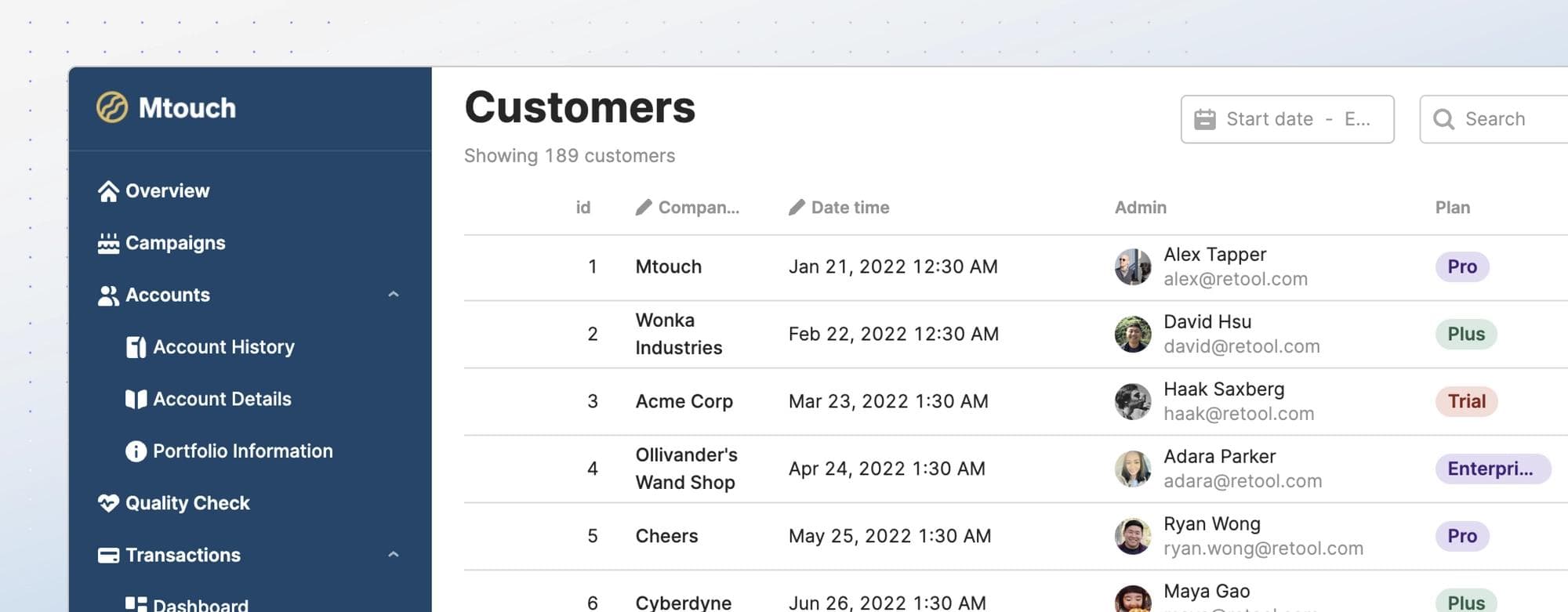
Internal applications are often complex and information dense. As a result, the user experience can suffer from a lack of information hierarchy and clear actions—making these apps difficult to learn and challenging to use. Here are three common issues we see in customer applications.
- The app either has no navigation at all or has a header that’s overloaded with content.
- The app is a long scrolling page with no clear structure.
- Secondary information is more prominent than primary information.
That’s why today we’re introducing the Sidebar frame. Together with the Header frame, this unlocks a variety of layouts that can make complex interfaces simpler to learn and more intuitive to use. The Sidebar frame can be added to any new or existing Retool application, and can contain child components just like the Main and Header frames do today. Along with the new Sidebar frame, we have expanded the capabilities of the existing Navigation component to support new usage modes enabled by the Sidebar.
Let’s dig into the new capabilities and layouts that are unlocked with this update!
You can now combine the Sidebar frame and Navigation component to create vertical navigation for your multi-page apps. Vertical navigation works better when there are many top-level menu items, which can be challenging to scan in a horizontal list. When you use the Header and Sidebar together, you can reserve the Header area for universal actions like search and account actions.
Before: The Header is overloaded with information.

After: Use vertical navigation when there are many top-level menu items.

A sample app showing this design style can be found here, and you can import it into your own Retool instance to see how it works!
One common way to balance complexity and usability is through progressive disclosure. Rather than showing everything at once, divide the content into multiple sections or steps so users know what to focus on first. With the Sidebar, you can now add in-page navigation to guide users within an app. Since the Sidebar doesn’t scroll with the rest of the page, it provides a clear, persistent overview of the app structure.
Before: A long scrolling page with no visual focus.

After: A more focused interfacing by separating the long-form content into multiple views.

Download a sample app that demonstrates this technique here, and then import it into your own Retool instance to play around with this technique.
A cleaner interface makes your app easier to learn and less error-prone. By hiding the secondary information and only showing it when needed, users can focus on the most important tasks at hand with fewer distractions. Since the Sidebar works just like a Container and can be toggled on and off dynamically, it is a perfect home for nonessential information.
Before: Secondary information takes too much vertical space.

After: Secondary information can be displayed side by side with the main content or hidden by default.

Download a sample application for this sidebar UI here, and import it into your own Retool instance.
In addition to the layout upgrades described above, the new Sidebar and Navigation features introduce improved scripting APIs and further opportunities for customization.
- Dynamically control frame visibility - Use an event handler or call the “setHidden()” method on the Sidebar frame.
- Do more with the Navigation component - each Navigation menu item can link to a specific app or URL, open a view of a container, or trigger any custom events.
- Show frames on a per-viewport basis - You can configure both the Header and Sidebar frames to be visible on either or both of mobile and desktop layouts.
- Dynamically generate Navigation component content - like many other components in Retool, the Navigation component's content can now be dynamically generated from query data.
The Sidebar is now available to all cloud customers and will be available in the next on-premise Retool release. Check out the docs to learn more about the Sidebar frame and the Navigation component. If you run into any trouble or have any feedback for the team, please let us know either using our community forum, or sending it directly via email to maya@retool.com.
We are excited to see what you build with these new features, and this is only the beginning! We will continue unlocking more layout possibilities and improving the experience of building multi-page apps. Let us know what other features you’d like to see to empower your team to create better UX for complex apps!
light Reader


